top of page


Legacy in Type.
PUBLICATION DESIGN
EDITORIAL
2021
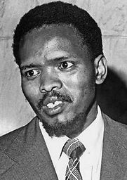
"The most potent weapon in the hands of the oppressor is the mind of the oppressed."
– Steve Biko


A typography-led editorial project exploring the expressive potential of a single typeface through layout, composition, and visual storytelling.
Concept
A specimen book designed using Biko, a typeface named after Steve Biko, an anti-apartheid activist and founder of the Black Consciousness Movement.
Design Approach
The project focuses on using typography as both content and form, exploring hierarchy, scale, and composition to create rhythm and narrative across pages.
Outcome
A cohesive editorial piece demonstrating how typography can communicate not only visual structure but also cultural and contextual meaning.
Role
Editorial Design
Tools
InDesign

Design Concept
To honour the cultural and political significance of the name, I based the design direction on African heritage and visual identity. I drew inspiration from traditional African colour palettes, featuring rich tones like ochre, red, green, and black, as well as geometric patterns often found in tribal art and textiles. These elements shaped the rhythm of the book and helped me build a visual system that felt rooted in history but interpreted through a modern typographic lens.


Design Approach
The design explores how typography can be more than functional, it can be symbolic. I used layout structures that evoke rhythm and strength, with large-scale headlines, bold grids, and colour blocks to reflect confidence and clarity. The content covers the anatomy, weights, hierarchy, and expressive potential of the Biko typeface, using sample texts that mirror themes of identity, resistance, and pride.


Discover More


bottom of page